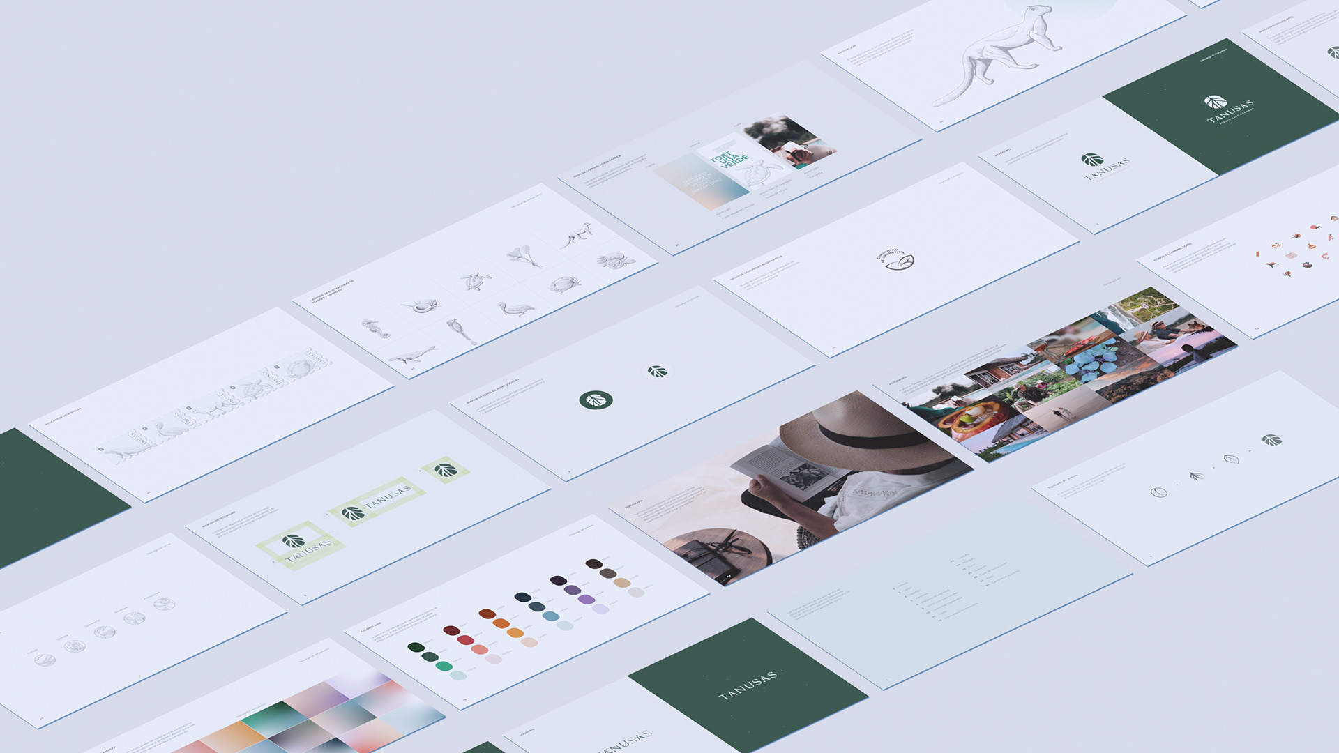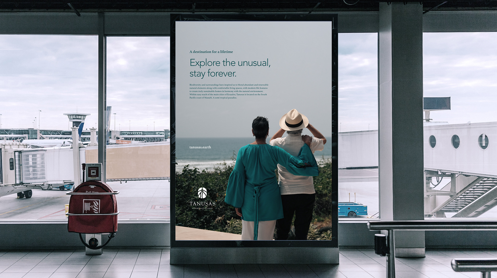


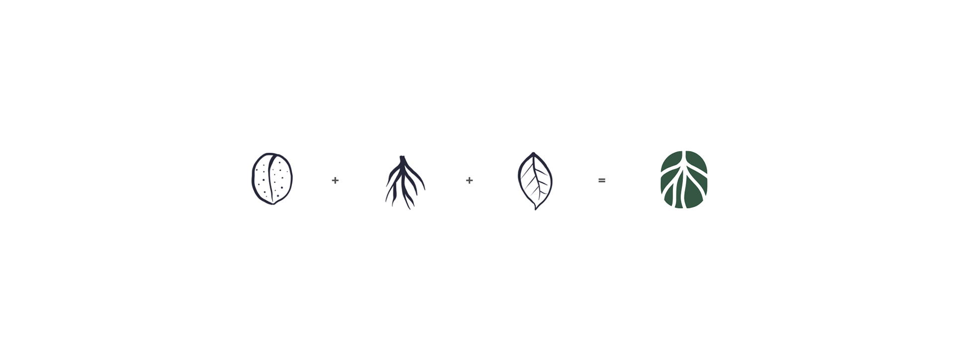
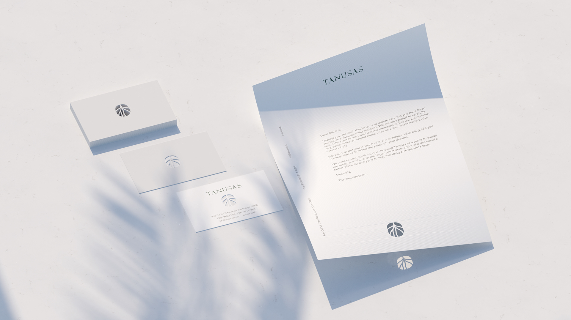
The symbol represents permanence, growth and the basis for life. This is a living project, and therefore it demands a living brand. The symbol becomes an iconic, interactive element that feels timeless and is versatile.

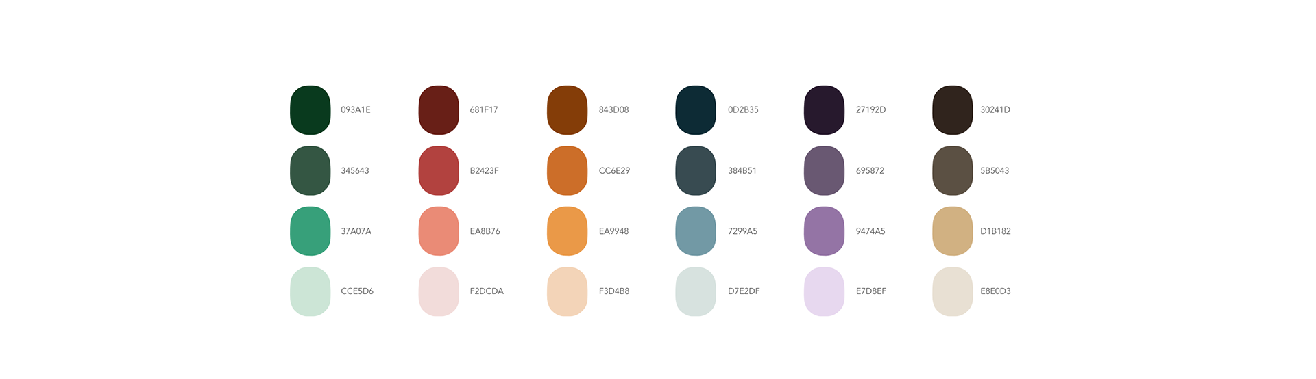
The base color palette is inspired by the elements in the territory. These colors are not static, but, like the days, are dynamic and are always changing. Thus, I created a set of gradients that apply this idea, by combining the base colors in different ways, creating an array of moods and visual options.

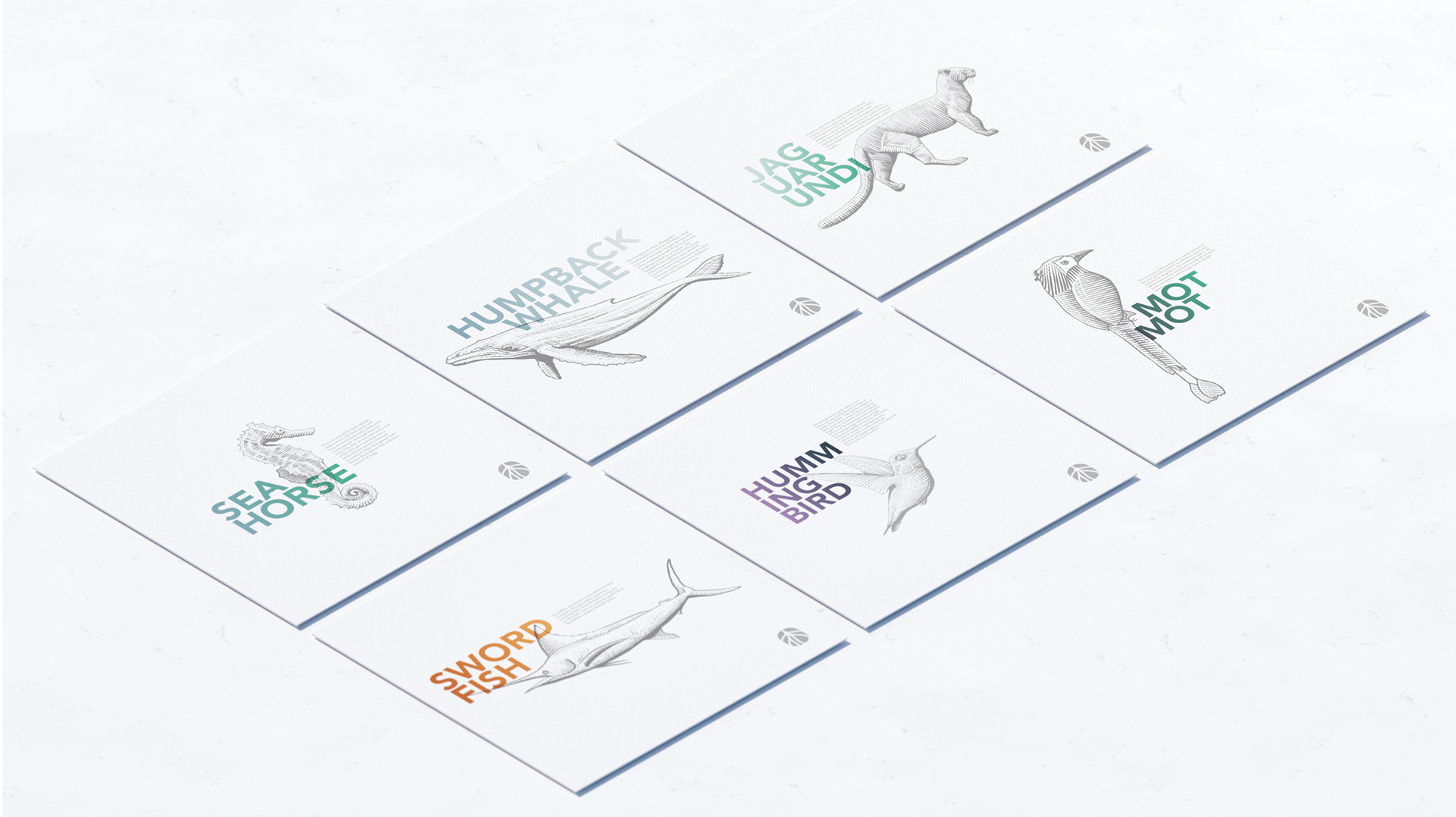
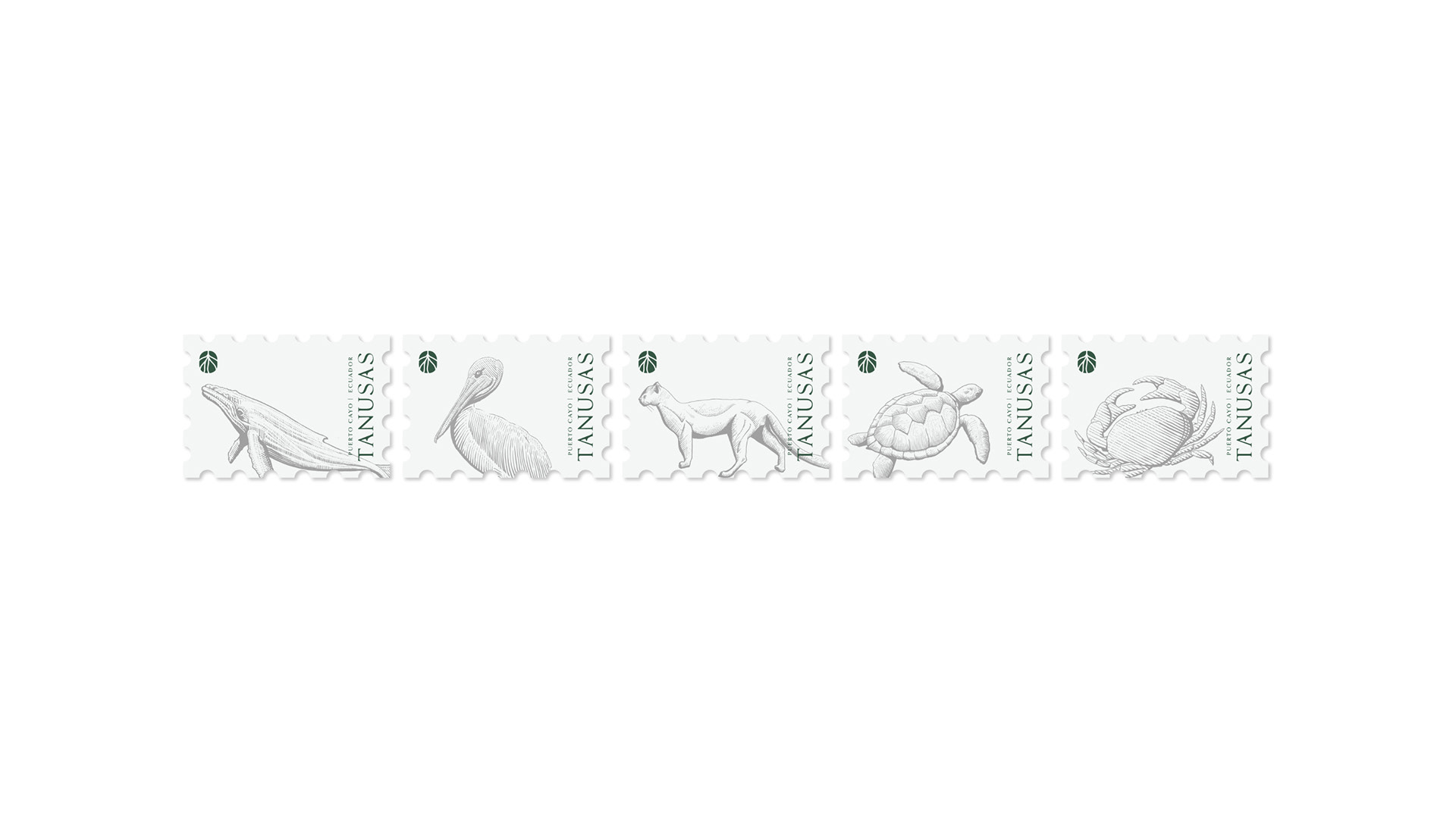
The illustration language resembles that of vintage scientific drawings. This illustration set becomes a functional tool that helps inform about the living inhabitants of the region, making it a more than ornamental visual asset with infinite possibilities.