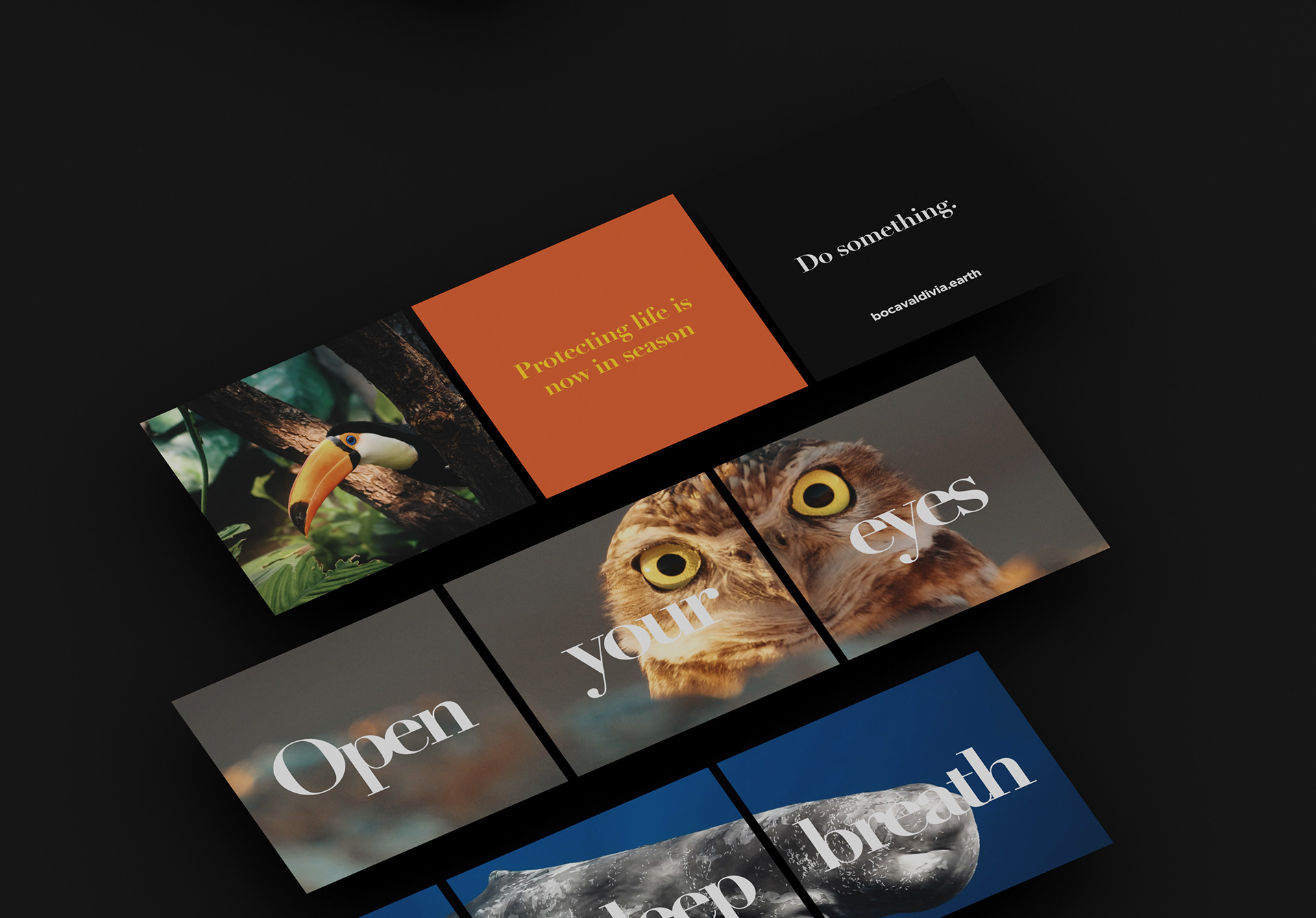
Bocavaldivia is a foundation that aims to protect and restore devastated land in Ecuador. The foundation is small but with big goals. We need to create a brand system that demonstrates these goals and proves that non-profits don't have to have bad design.
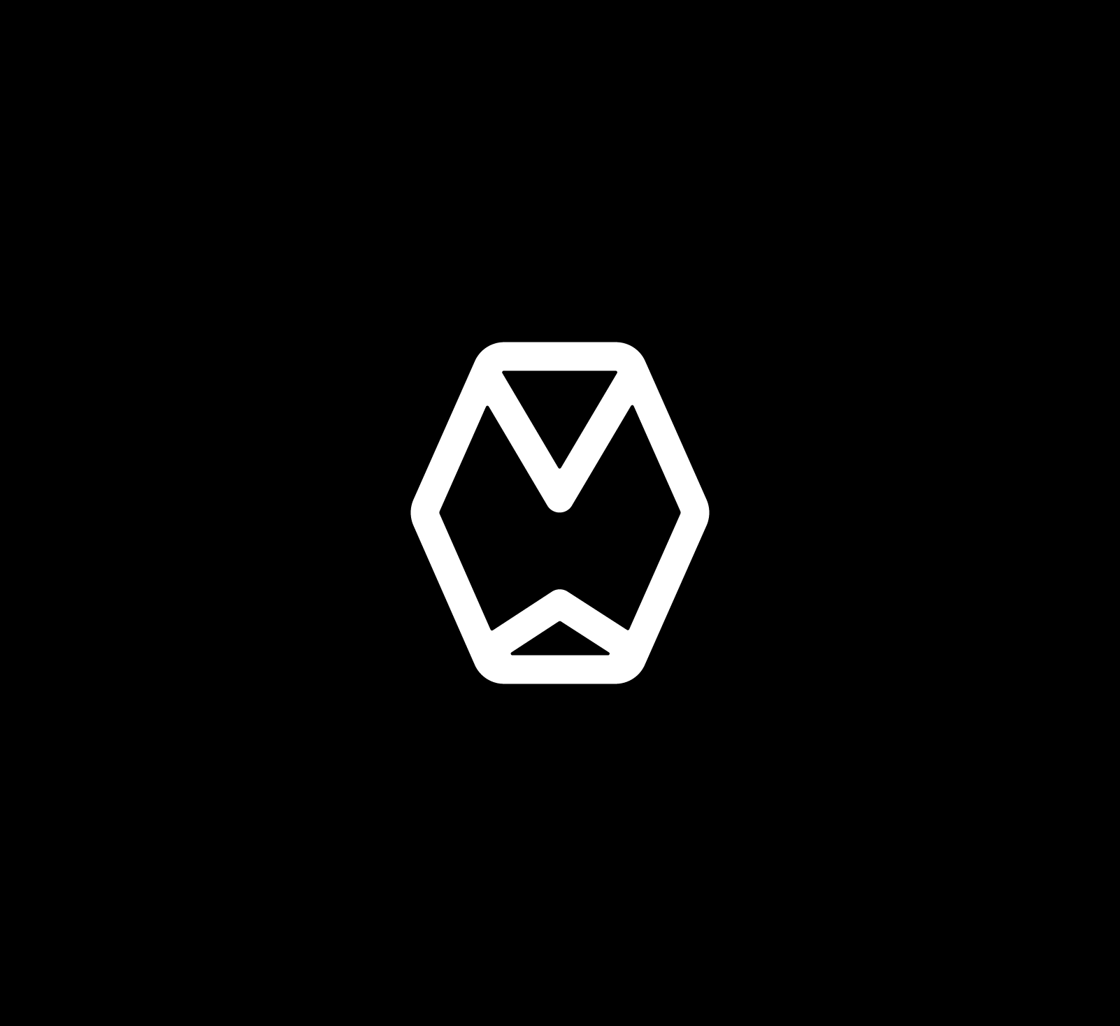
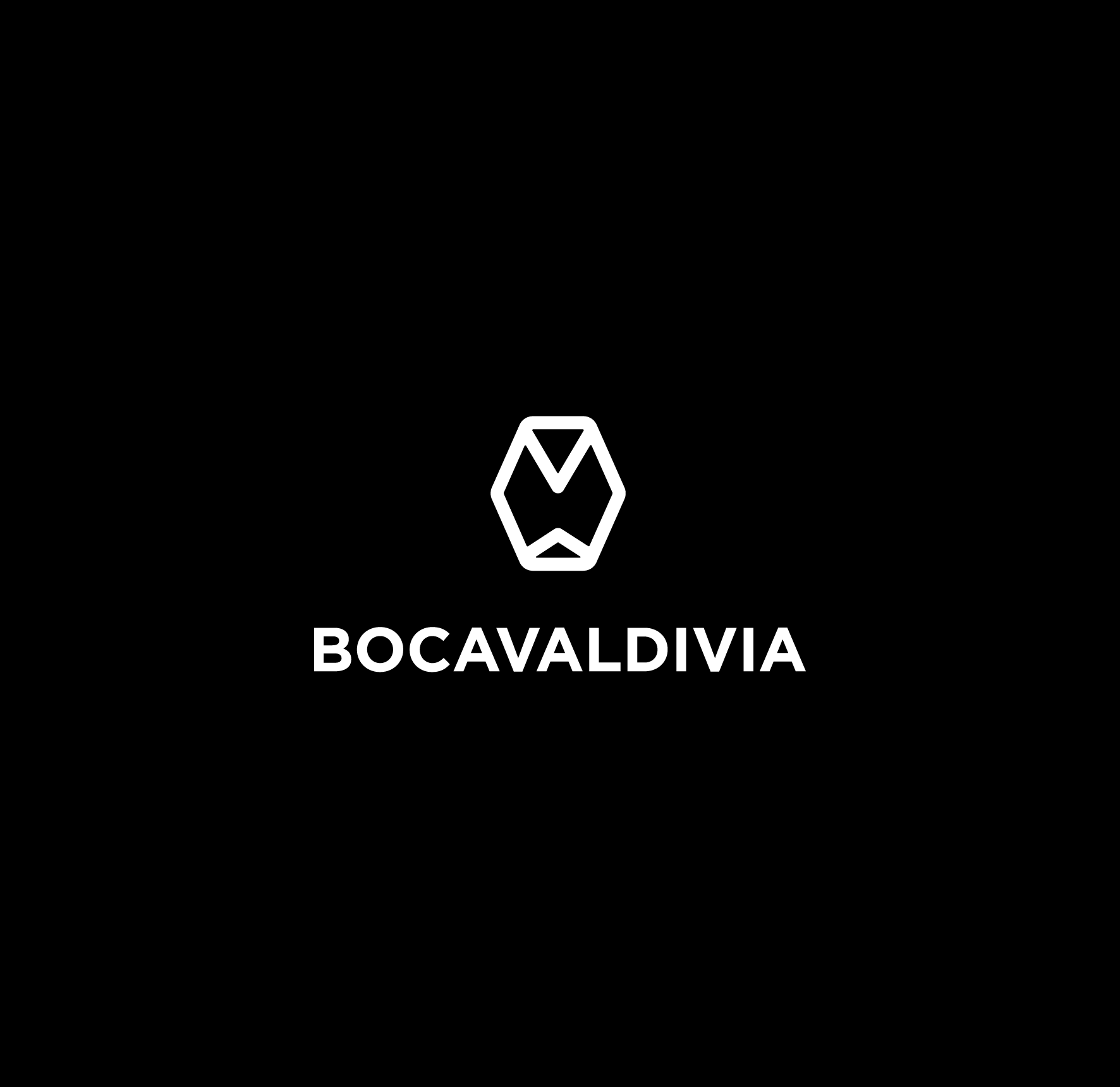
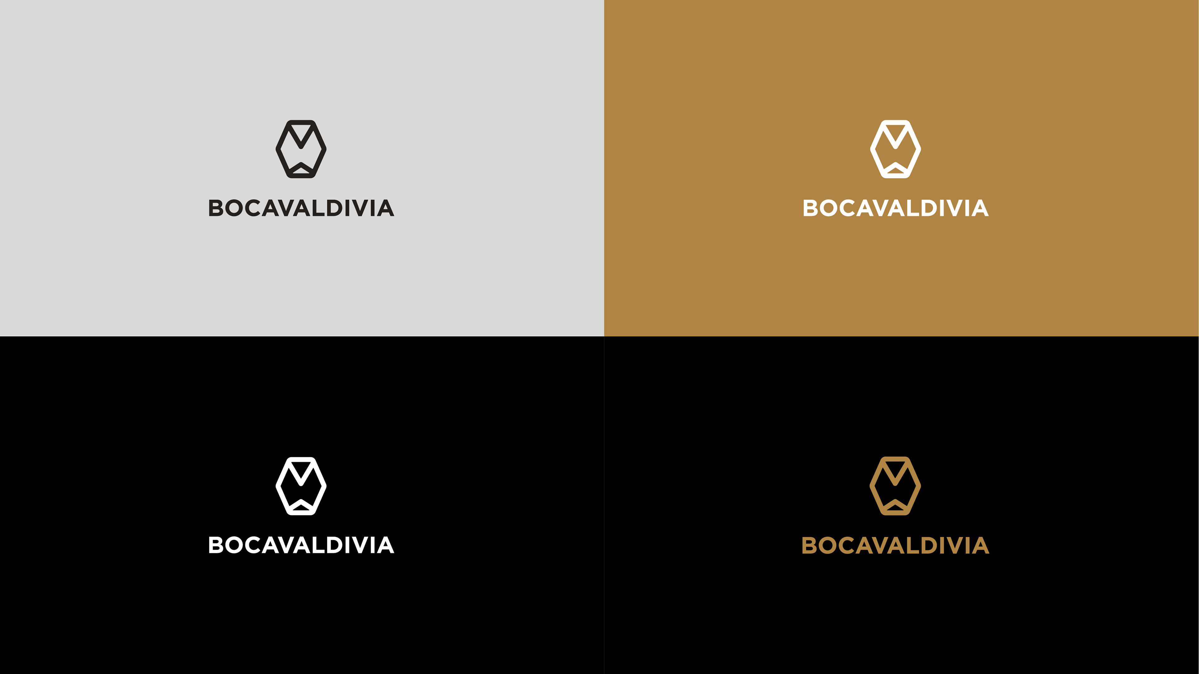
The symbol designed is an owl, inspired in the abstract representations of this animal by the Valdivia culture. It bears the meaning of wisdom, expansion and awareness and it is a timeless mark that is simple and iconic.


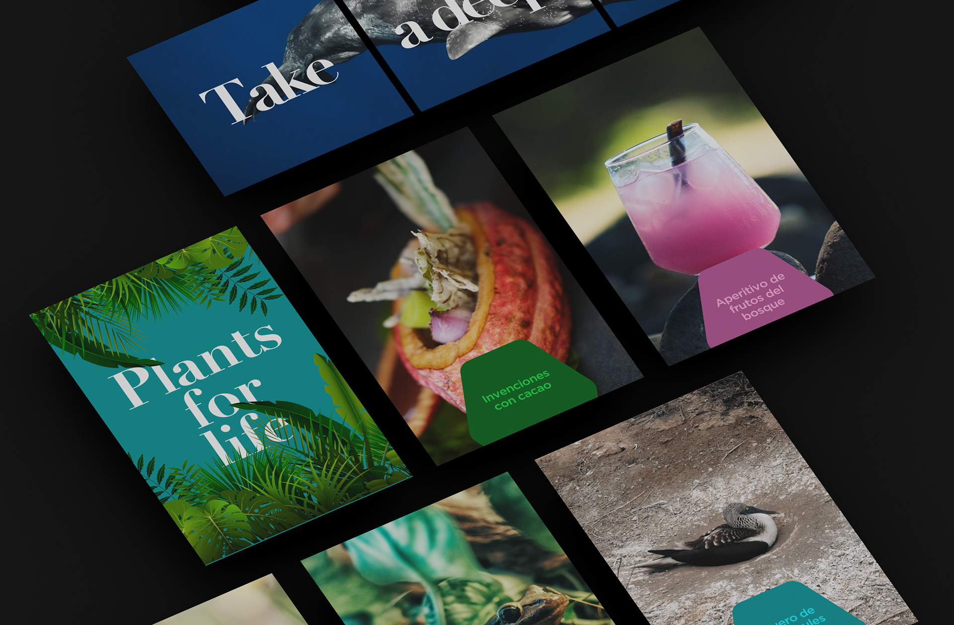
In addition to the brand system design, I got to work on the tone of voice and copywriting guidance as well as prototyping products, packaging and other concepts.
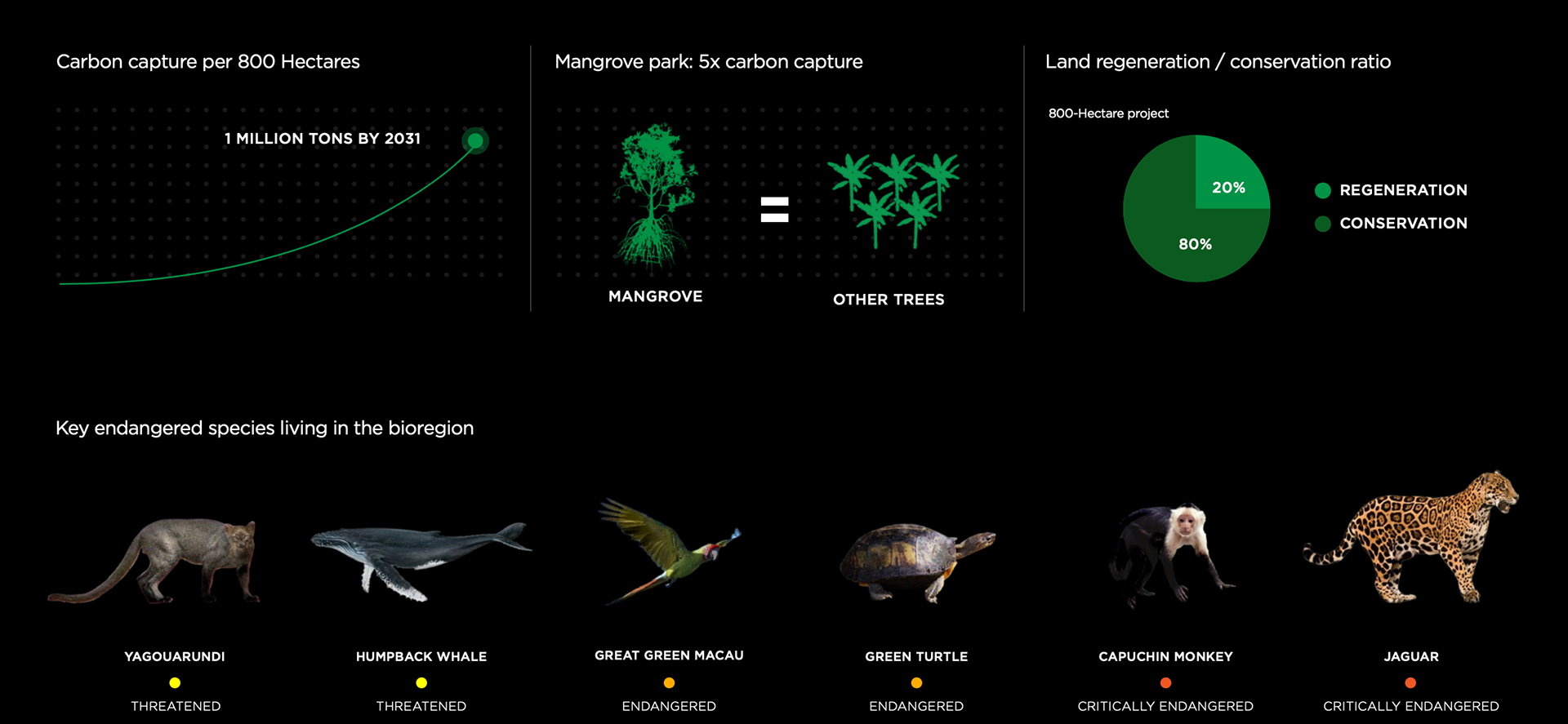
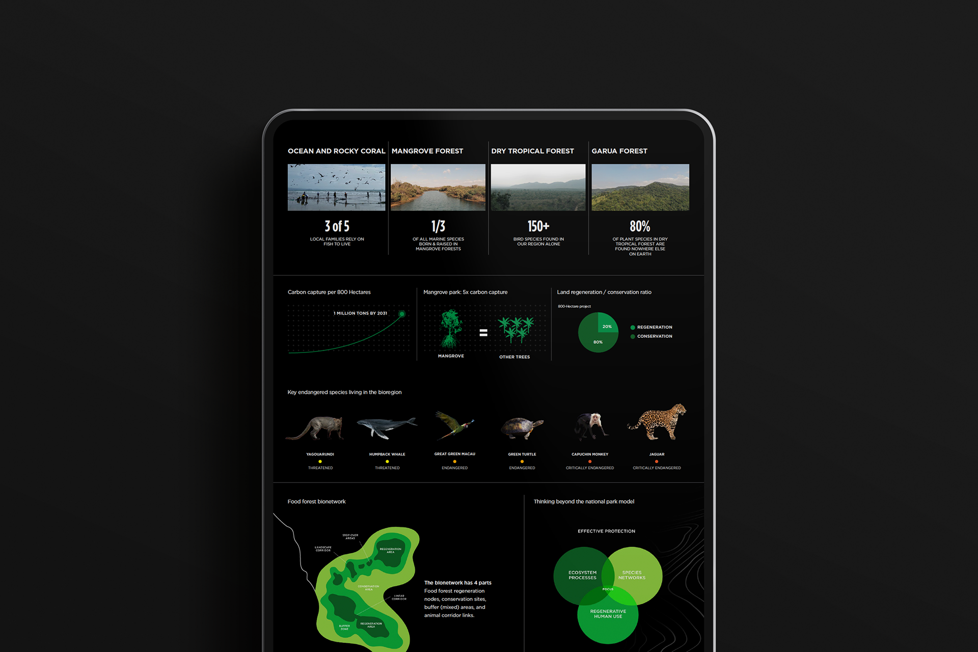
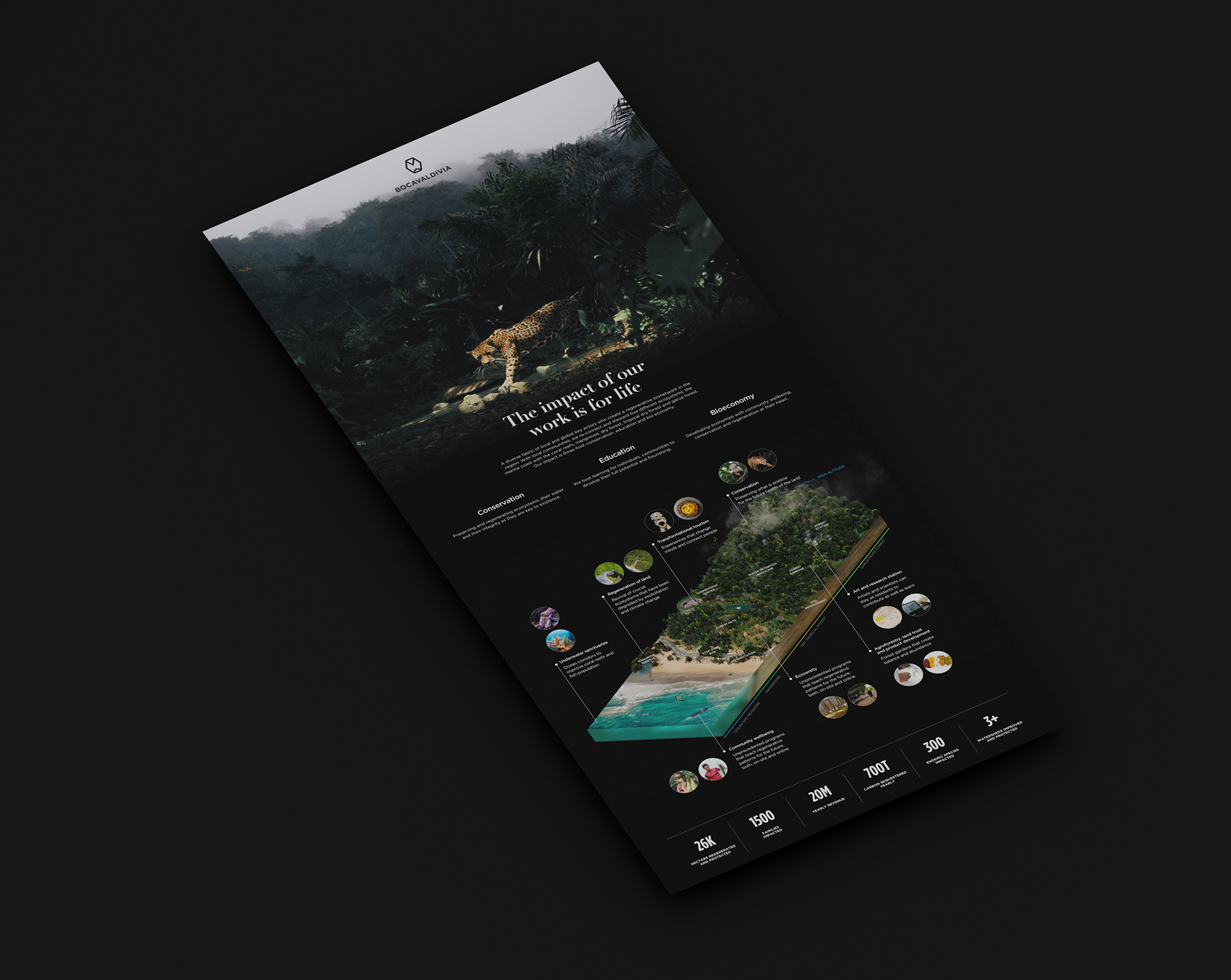

This project represented an opportunity to develop a full brand system, which includes the creation of visualizations of the territory and its complexity. This region is one of the 36 biodiversity hotspots of the world. It is most certainly threatened by climate change as well as aggressive local agriculture and development.